
To date, I’ve designed the covers for all of my books. Being a graphic designer by trade has been a helpful perk, and it’s saved me a lot of time and money in getting started. So I venture into the realm of cover design not because I think my covers look bad, but because I’m a designer, not an artist, and I think sometimes a book cover needs a little something more than some text on a textured background.
Most people would consider both of the series I’m currently writing to be cross-genre, meaning their subject matter falls into two or more (and in my case, multiple) fiction categories. And since most people are the people I want reading my books, I think I owe it to them to provide covers that elicit an immediate response – a sense of familiarity with the subject matter, even though it may draw its inspiration from many different sources, both new and established.
The Aionach Saga is just such a series. I’ve termed it post-apocalyptic fantasy, as the series contains everything from derelict cities to monsters, mutants, heroes, and magic in its various forms. This is where I’m starting my overhaul, so let’s take a look at the current cover of Book One in this series, The Infernal Lands.
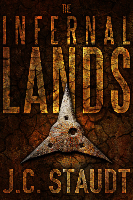
This cover is one I’m very pleased with (and proud of). It’s bold and attention-grabbing, and it contains a symbolic representation of an important element in the story. The problem is that once it grabs your attention, your attention doesn’t know what to do with itself. What does this cover say to someone who has never read a book in this genre? What kind of story is this? What happens in the book? Well, it’s a huge book, and you can get an idea by reading the blurb. But there’s no imagery on the cover that speaks to a potential reader. There’s nothing, aside from the title, that actually means anything.
This is where I, as an author, have the opportunity to do a better job of selling my story. The Infernal Lands is a large and complex book with seven different POV characters across five distinct story lines that begin separately and are woven together as the narrative progresses. As I discovered while writing the blurb, it’s hard to encompass all that and boil it down into a few short paragraphs. The same is true for the cover. But I think we can do better where that’s concerned.
In that regard, I’ve decided to commission a couple of pieces of artwork for this and the next book in the series, Children of the Wastes, which I’m in the process of writing as we speak. I’ll continue to do the layout and typesetting for this and all my future works, but I needed an artist’s expertise to bring the images in my head to life. I’ll be doing the new cover reveal for The Infernal Lands here, on this very blog, within the next couple of months.
These pieces of artwork will be landscape-oriented so they wrap around the entirety of the print books from front to back, but still provide a captivating image for the ebook versions. They’ll depict a scene from each of the books and (hopefully) provide potential readers with a more accurate first-glance depiction of the genre and characters of this series. It’s going to be a while before I know whether the new covers accomplish that goal, but I figure it’s worth it to at least play around with them. Then, when people judge them by their covers, they’ll have something meaningful to judge.